Most Lemmy UIs seem to have an inbox that works a bit like this:

Without context, I don’t really understand what’s happening. A link to the parent comment is usually available, but it takes me out of my inbox.
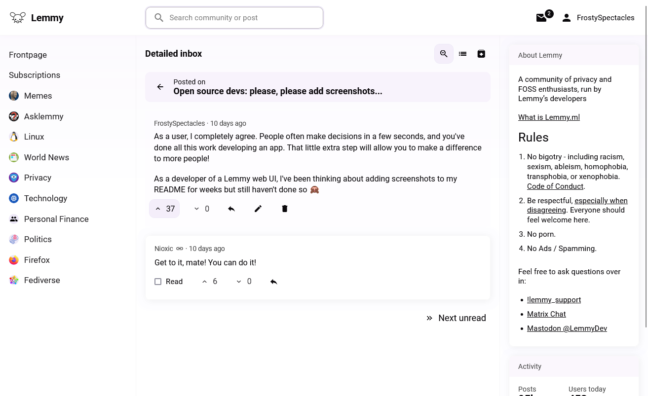
Here’s how I approached it in Lemminator:

All context is right there, and I can work through my unreads one by one. A conventional compact inbox view is also still available:

Would this work for you? Do you prefer the classic inbox?
Never seen it like this, but I think I prefer it the way it is now. I don’t want my inbox here reading like email, I’m perfectly fine with clicking the comment to go back to the conversation. It also gives you a chance to see if there are further comments below the immediate reply.