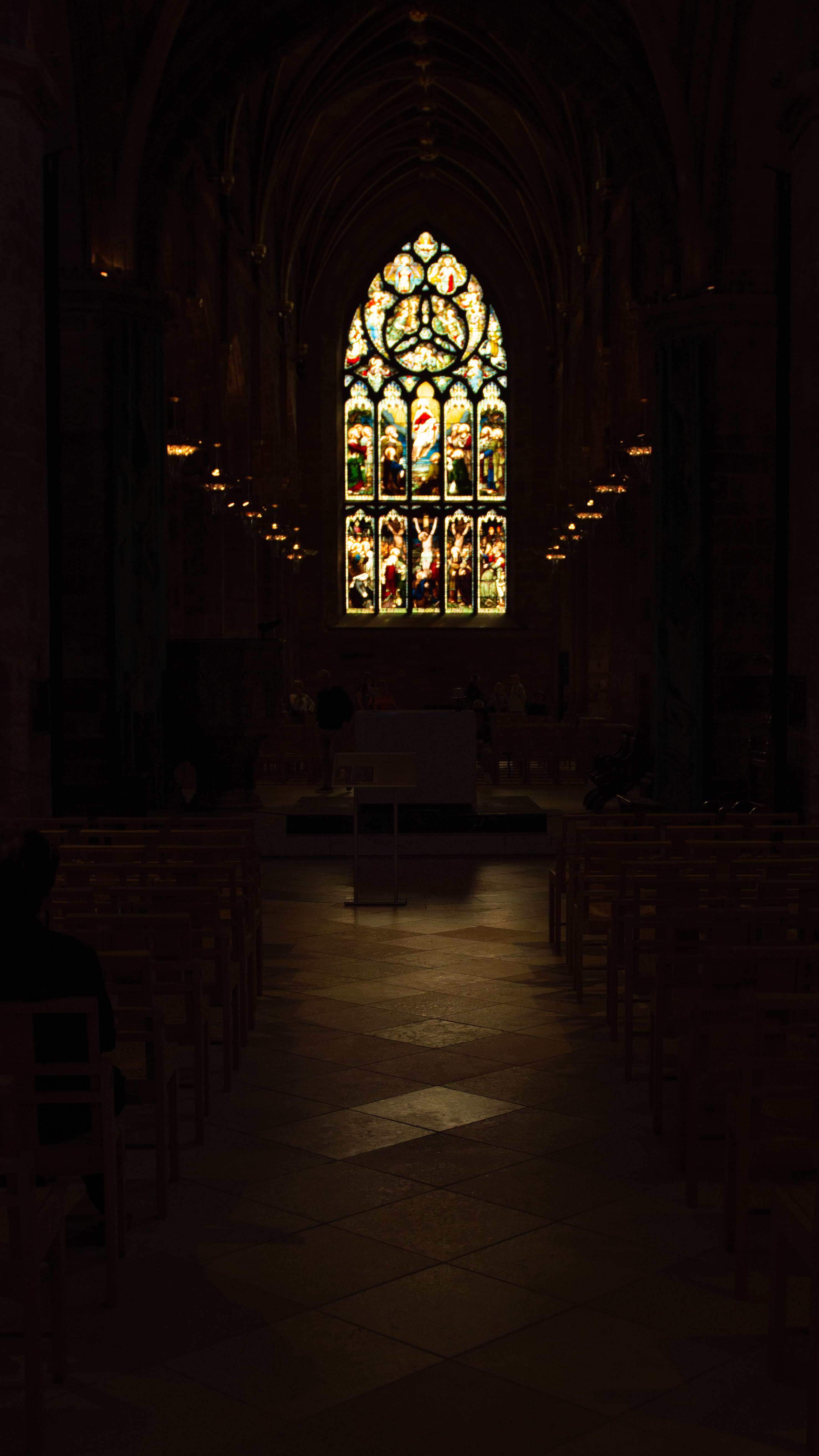
Hey all, I’m going back and forth on this one so I thought I’d ask for some feedback. I really like the moody atmosphere of this pic, but I’m worried that it’s just too dark on most viewing devices except for a nice monitor or a good print. I can brighten the image, but there isn’t much of visual interest in the darker areas, so I’m worried that it will be too boring of I do so. Thoughts?


I get what you’re doing with the composition here, but I feel like this would be a much stronger image if you cropped the bottom 15% or so, so like the first two diamond-shaped tiles off of the bottom. If you do that, you make the aisle look much brighter on average, which makes the image look brighter, which keeps you from having to bring up the darks as much.
That said, I do think that you need to be a touch brighter so that the geometry of the pews is visible, because all of those straight lines pushing towards the center will do some work in making the image look more interesting. I think there’s also interesting geometry in the lights in the ceiling coming straight down, too.
I’ll give this a try, i think the crop is definitely a good idea!
Here’s an updated edit:
https://lemmy.world/pictrs/image/cd9f5b11-4d14-4035-9e52-fad20488f229.jpeg
IDK about you, but I find that much more effective.