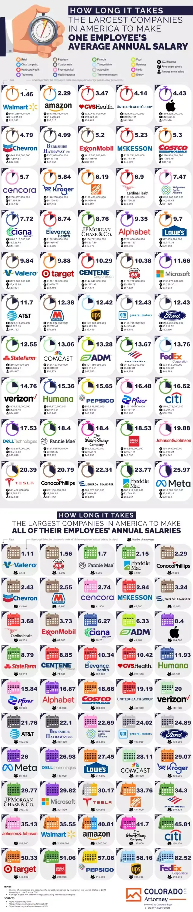
That “flaw” you pointed out is the point of the infographic. It is literally just to visualize the proportion of revenue paid to employees. No one is saying that the rest of the revenue is straight up profit, I cannot even imagine how you came to that conclusion.
The revenue vs profit aspect is also difficult to measure. An example as to why is Amazon claimed it made no profit for years, because it reinvested all of the revenue it gained in addition to revenue that paid for operating costs. Are you going to believe Amazon’s claim? Most people would argue they did profit, and that reinvestment is still profiting, but that’s not how things are often measured.
Well, one could argue that since this community is called “work reform”, the point of this infographic is to make workers aware of how much more companies would pay them. This infographic does not accomplish that.
If your company buys a chair for 1000€ and you sell it for 1001€, the company got a revenue of 1001€. You cannot ask more than 1€ to be paid to you for it though, since the company would be losing money. That’s what is called a profit margin.
This infographic shows companies from a wide range of sectors, and a wide range of profit margins as if they were comparable. You cannot compare the wage/revenue ratio of a supermarket to a tech company, since they operate at different profit margins.
You can compare wage/(profit+wage) ratio though, as it measures which part of the pie goes to the workers and which to the company, and that is universal.
It is true that it’s hard to measure “profit”, but that fact doesn’t make this infographic any better.