

- cross-posted to:
- [email protected]
- [email protected]
- [email protected]
- cross-posted to:
- [email protected]
- [email protected]
- [email protected]
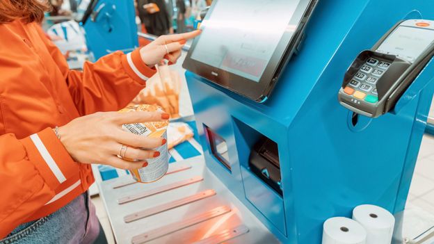
‘It hasn’t delivered’: The spectacular failure of self-checkout technology::Unstaffed tills were supposed to revolutionise shopping. Now, both retailers and customers are bagging many self-checkout kiosks.
Ah yes, typical technical folk, blame the user for bad design.
If your target audience can’t use what you’ve designed, it’s the fault of the designer, not the user.
I say this as having been in IT for 30+ years now. This argument is always presented by juniors, because their design “couldn’t possibly be wrong, the users are just doing it wrong”.
UI needs to be intuitive and obvious. Don’t blame the user if you failed at this.
Edit: Hahahaha the downvotes! Please, send me your resumes, so we know who not to hire! Hahahahaja
Like I said, the same self-checkout machines work wonderfully in switzerland. 🤷♂️
There are many people who can’t grasp anything technology related. I’ve seen people tapping a can against the scanner instead of scanning the barcode and getting mad it didn’t work. UIs on most self checkouts these days are the same with different branding and they work well.
It is impossible to make something everyone can use when people let their brains shut off any time they have to use a machine.
I don’t know why you are being downvoted, must be a bunch of people wanting to defend a shitty UI.
Because you’re right, a self checkout shouldn’t require technical knowledge to use.