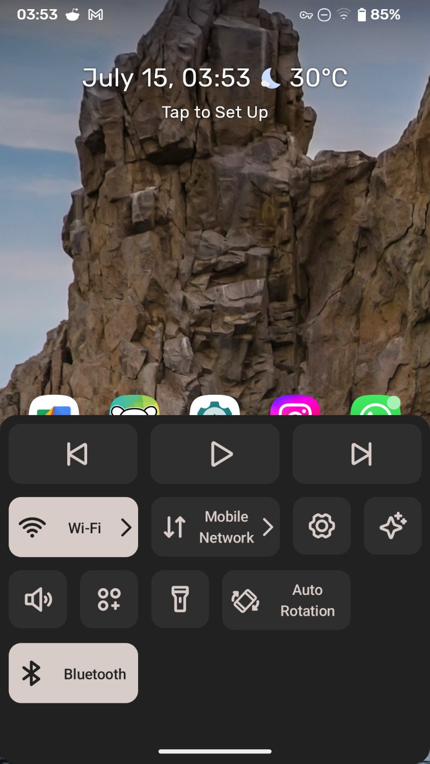
Ever since I switched back to Android after a couple years of using an iPhone SE, i have been missing the iOS feature to open “control center” (iOS term for quick shortcuts) using a swipe up gesture from the bottom of the screen.
This is a great feature that eliminates the need to reach for the top of the screen to pull down the notification shade to access toggles for commonn settings (wifi, cellular, BT, hotspot, torch, etc.). Since we live in an era of huge phones such a feature would have been extremely convenient. Unfortunately it’s not implemented in Android.
But I accidentally stumbled upon an app called Neo Launcher that has implemented a similar functionality (kind of, since iPhone control center can be summoned no matter what app you’re using, but this only works on home screen).
A dashboard pops up from the bottom of screen, where your thumb can easily reach, with a user-defined shortcut! Toggling wifi and other settings are much easier this way.
I’d highly recommend everyone to give this a try. Personally I’ve set double tap on screen as a shortcut for the dash.


Yeah as you said you have to swipe down twice and strech your finger to the top of the screen (or use the other hand). Definitely a bottom dashboard is more convenient.
If the argument is that swiping down twice is more difficult than swiping up once, then I agree. If the argument is that swiping up once should be reserved for system toggles, then I disagree. I believe it’s a question of properties, not capability, when it comes to Android’s decision.
There is an option in MIUI to swipe down on left side for notifications and right side for Control Center.
Really old Android devices used to do this, particularly tablets during the HC/ICS/JB era. It was kinda confusing IMO
I think it was part of Tablet UI for Android 3.0 Honeycomb.
I have a Huawei, a Xiaomi and a OnePlus and suddenly around one year ago they all sent an update to do that - I wonder who did first and who copied it. I find it illogical, why separate notifications from the rest?
It was made for tablets in Android 3.0 Honeycomb.
I don’t know about others but MIUI (Xiaomi/Poco) have an option to disable it.
I once tried a Xiaomi phone and that was the most confusing part.
I feel the same, that’s why I turned it off.