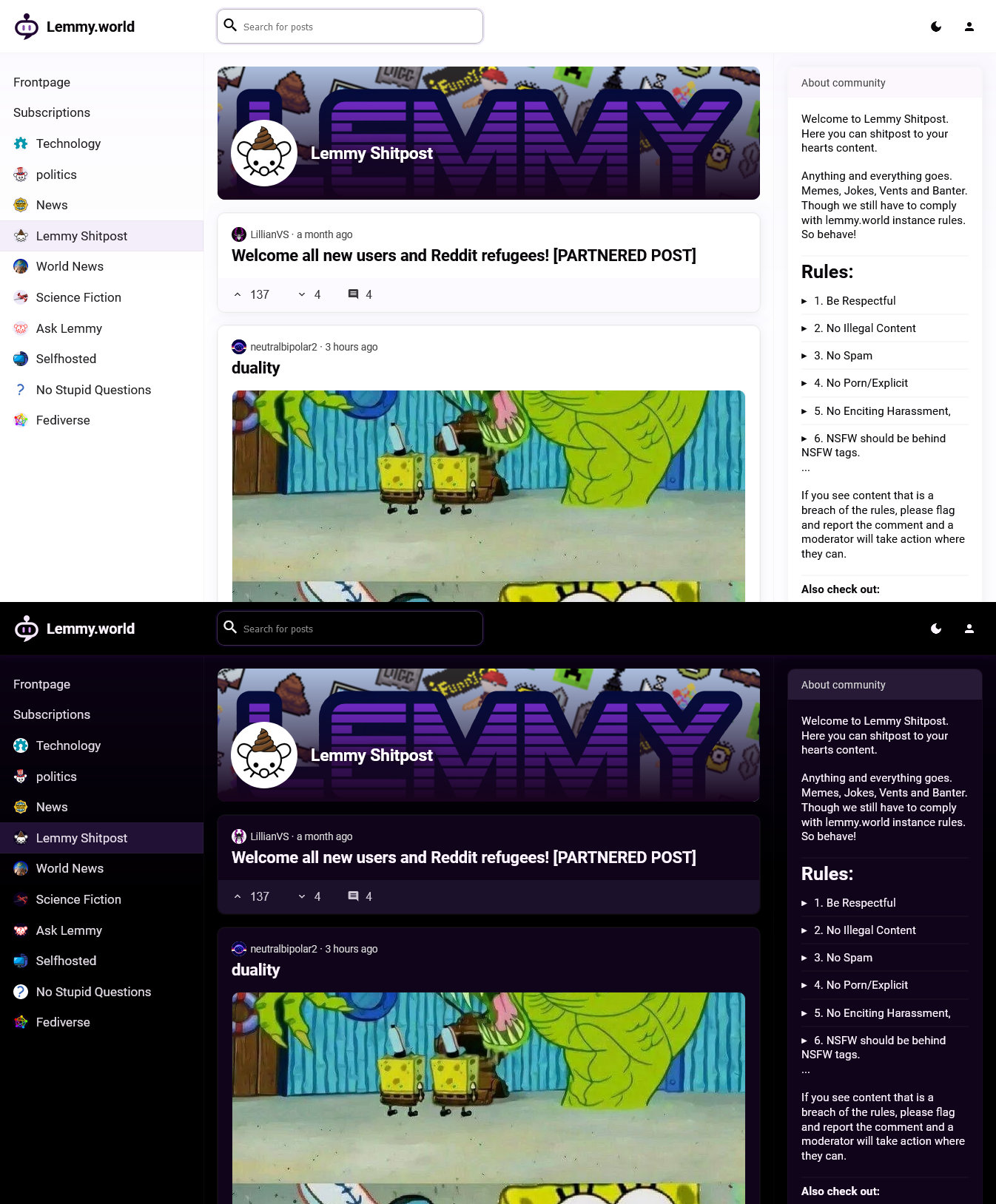
I’d like Lemmy to attract a wide range of folks who contribute to a diverse range of communities. While the official web UI is very rich in features, I think it might be a bit intimidating for non-IT people.
So I figured: why not try to be the change I want to see in this world? Here’s my attempt, implemented in SvelteKit.


It looks really nice! Only thing I’d change off the bat is to stretch the search bar so itd the width of the middle section. Having search be more accessible would help a lot with duplicate posts so people search before posting (imo search should be integrated in the post section like how discord forums work so while your typing the title for your post it searches so you can see if there is already a thread on it)
Not sure I’d make the width cover the full middle section, but I agree that search needs to play a more prominent than in Lemmy’s official web UI. The related post search is an interesting suggestion I hadn’t considered yet!
I’m betting that it stretches, whenever you put your cursor in it. I agree on your sentiment about making searching more prominent. Also including search results for current community would be awesome to prevent reposts as you said. The same for URLs would be neat.
It’s actually pretty powerful as of now, it just needs a fresh look and new placement.