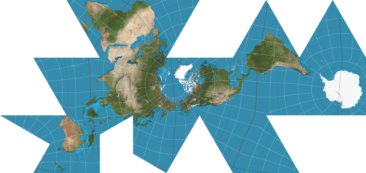
PlumM to [email protected]English • 6 months agoDymaxion mapen.wikipedia.orgmessage-square15fedilinkarrow-up188
arrow-up188external-linkDymaxion mapen.wikipedia.orgPlumM to [email protected]English • 6 months agomessage-square15fedilink
minus-square@leftzerolinkEnglish2•6 months agoTo be fair the Dymaxion is less confusing if you add “fold here” lines… but then you end up with (an approximation of) a globe. The same criticism is applicable to the Waterman, though; both are more unfolded globes than proper maps.
minus-square@[email protected]linkfedilinkEnglish1•5 months agoYeah I know, it’s just really confusing to look at. But that’s probably just due to the fact that the north pole is at the top and America is in the centre and not GMT/Europe

Yeah that’s way less confusing.
To be fair the Dymaxion is less confusing if you add “fold here” lines… but then you end up with (an approximation of) a globe.
The same criticism is applicable to the Waterman, though; both are more unfolded globes than proper maps.
Yeah I know, it’s just really confusing to look at.
But that’s probably just due to the fact that the north pole is at the top and America is in the centre and not GMT/Europe