This website contains age-restricted materials including nudity and explicit depictions of sexual activity.
By entering, you affirm that you are at least 18 years of age or the age of majority in the jurisdiction you are accessing the website from and you consent to viewing sexually explicit content.
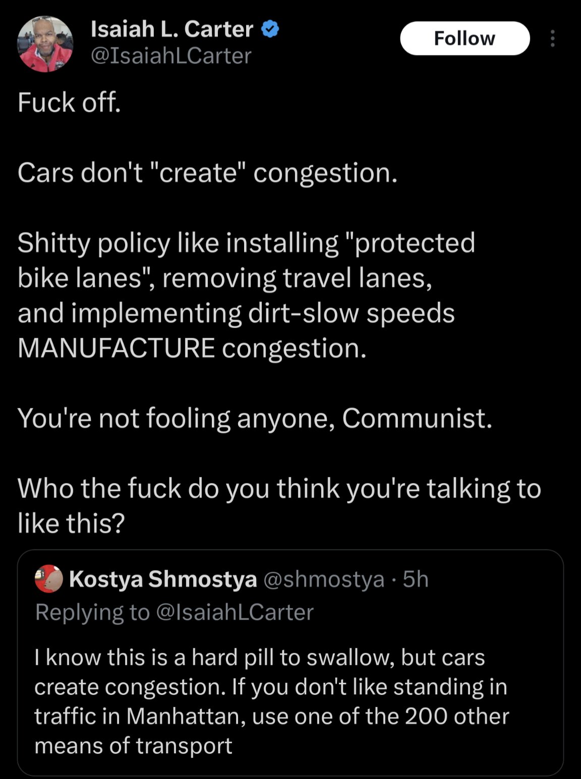
I think it’s more for design language, you’re subconsciously drawn to the green vehicles because they’re different, and subconsciously when you’re looking at the traffic, you’re reminded what it’s like being in the traffic yourself.
So you imagine yourself as the green car.
1st scenario: traffic is really bad. 2nd scenario: they’ve added more lanes, but you, the green car, are still stuck. 3rd scenario: public transportation has alleviated the traffic and it’s better for all.
Notice in the 3rd scenario, all the transportation is green. I think it’s to make you think, “I can ride my bike to work” or “I can take the bus” or “I can still drive my car if where I live requires me to” depending on your own situation. It’s to show all options can be viable, if you support public transportation.
That’s how I see it at least.
Full marks for interesting nuance, for what it’s worth. I would love to think every designer thought this hard about their own work.