This website contains age-restricted materials including nudity and explicit depictions of sexual activity.
By entering, you affirm that you are at least 18 years of age or the age of majority in the jurisdiction you are accessing the website from and you consent to viewing sexually explicit content.
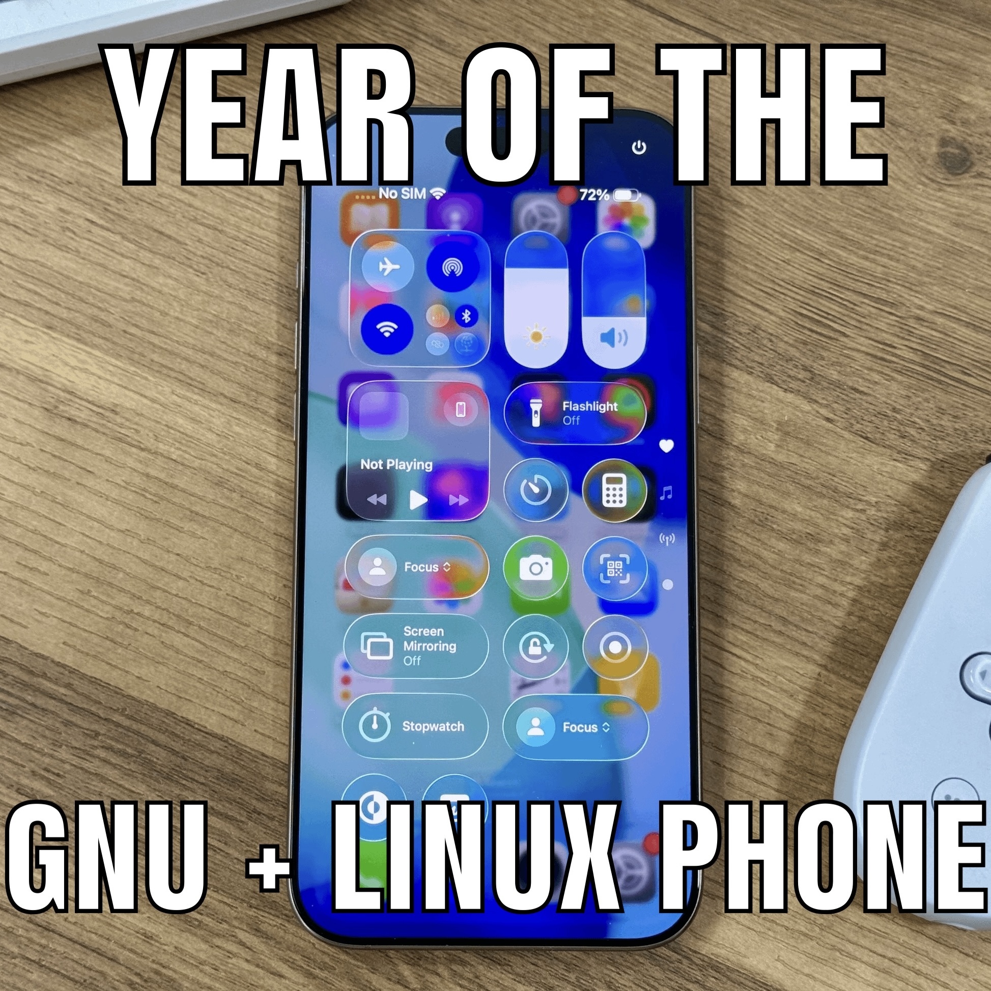
I don’t know why they made the background blur so subtle. Even I, as a non-UI/UX designer understand that readability is important. Apart from the slightly harsh edges, I think Liquid Glass looks solid. Way better than hideous flat design.
EDIT: To clarify, “Liquid Glass” looking solid does not mean the appearance seeming to not be liquid. It is, in fact, liquid.