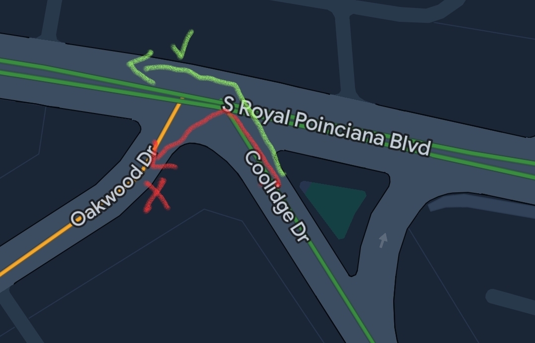
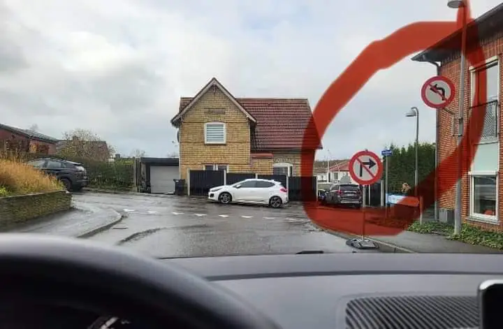
I’m pretty sure it’s saying you can’t turn left onto the road to the left of the intersection. Looks like some pretty bad road design.

I didn’t realize we were here to play geoguessr but you win!
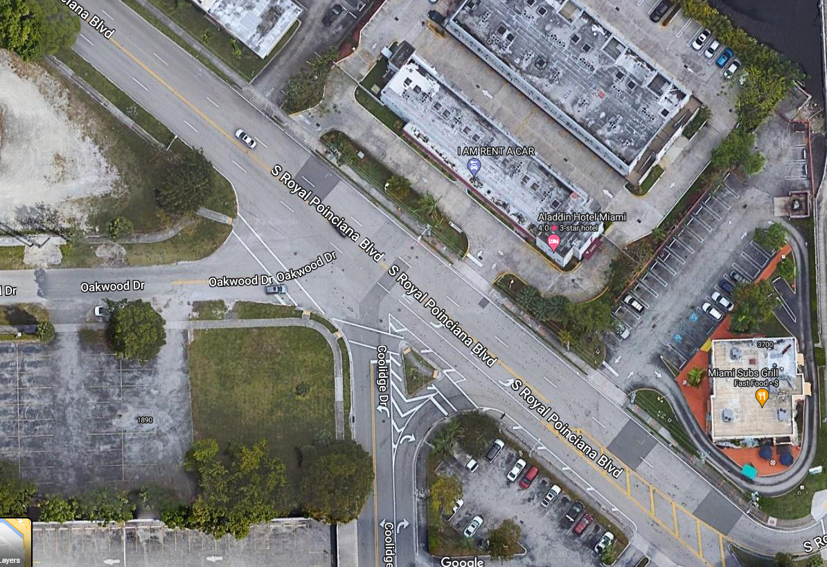
I’m gonna say it’s easy when the street names are in the photo.
It’s also easier when there are no rules saying you can’t enter that road name into Google maps.
Easier, definitely. And a unique street name. But it’s quite hard to read the cross street name. All I can see is the “E DR” at the end. I probably wouldn’t have bothered from just seeing the one street and no other text.
I got lucky with Google Maps highlighting the apartment building in the background as a POI to match up with.
Atlanta and Peachtree Rd/Ln/Dr/Ave/Way/Plaza/literally 65 more variations of this say hello.
I think it makes giving directions easier. Everything in this town is ‘just off Peachtree’
Mr 305 ova’ere
¡Dale asereeeee!
I understand the intent from your graphic, but given the signage, I would not have known what they expected of me.
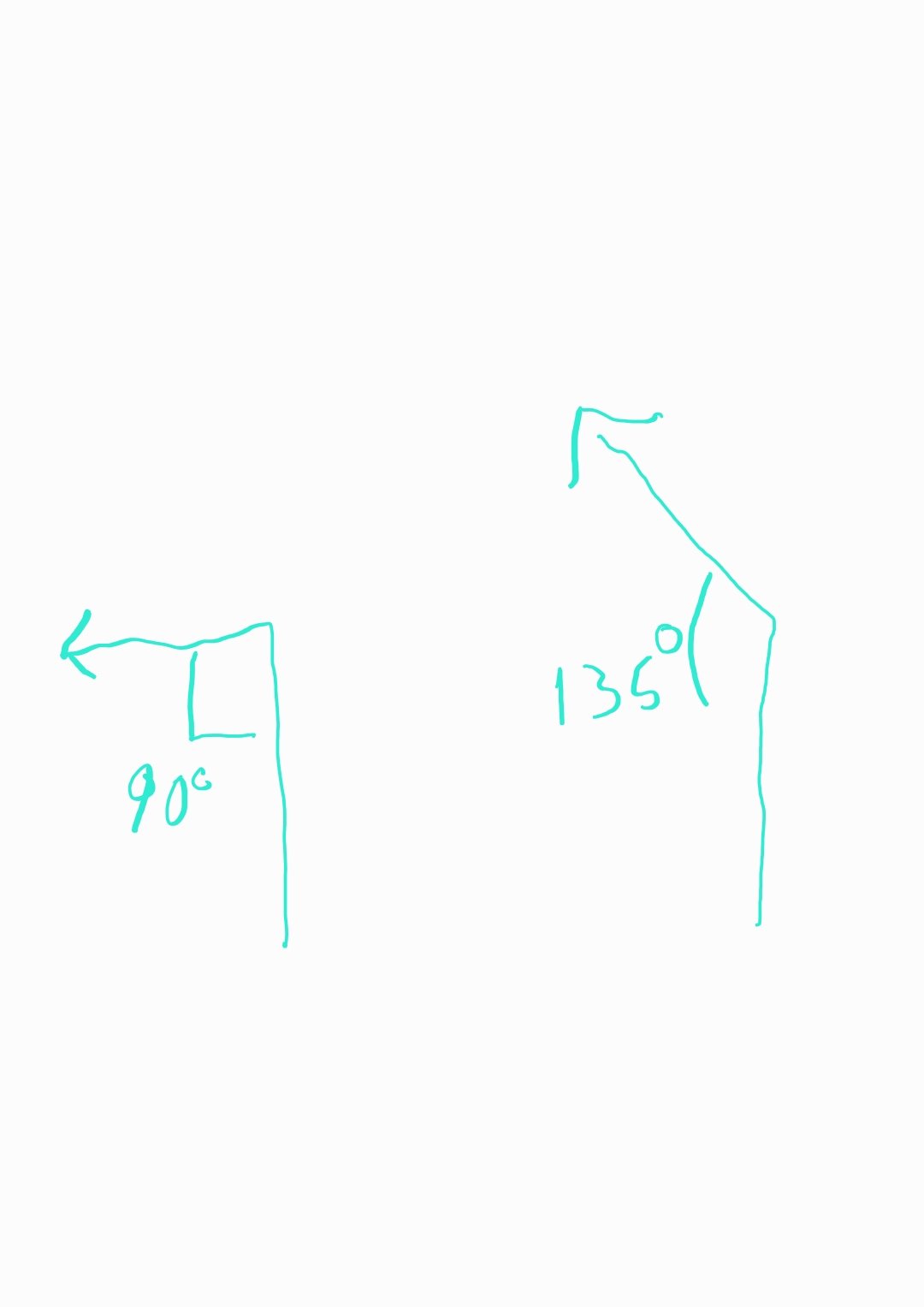
The painting on the road should indicate a 45° left instead of 90° left.
More like 135°.
Relative to forward travel it’s 45°.
True, although since you’re specifically referring to the angle indicated by the painting on the road, referring to the angle of the painted arrow itself would be clearer.
? I’m saying the painting on the road should be painted as 45° instead of its current 90°.
I think they’re saying the arrow would be drawn at a 135° angle compared to the “vertical” base.

You’re absolutely correct. I just thought it made for a funny photo. It’s very on brand for this city to do dumb shit like this.
I’ve been confused and made dangerous choices in traffic for less stupid reasons. Not trying to deflect all blame but considering the lowest common denominator, road construction and signs really need to pay much more attention to the limits of the human brain.
Half of us have an IQ below 100 and we could be driving in darkness, with rain pouring down and facing traffic that shines its headlights into our eyes. The road needs to have an affordance that suggests to the driver how to drive correctly, instead of causing confusion when you already have a lot of traffic to keep track of.
Bad road design for sure, but the sign still could be better. For example they could make a custom sign, draw the intersection and mark explicitly that you can’t turn to Oakwood.
Or just have the sign arrow be more than 90°
deleted by creator
This is exactly the type of content i was hoping for when i clicked on the comments. Thank you for all you hard work sluthing for an explination of a random photo. Its truly gods work that your doing.
Apart from what some commenters already pointed out (about the orientation of the roads there), I’m not sure how it’s going in the US, but in Europe, we have a hierarchy, where the sign on a pole takes precedence over the sign painted on the road.
The hierarchy is:
- Police officer’s hand signs
- Traffic lights
- Signs on a pole
- Signs painted on the road
According to this, you cannot turn left, even though it looks like a left turning lane.
Is there such a thing in the US?
Is there such a thing in the US?
Yeah.
- Whatever the heck I want, because “ma freedom”
- Police officer’s hand signs
- Traffic lights
- Signs on a pole
- Signs painted on the road
in Europe, we have a hierarchy
This is definitely not true for all of Europe. In Germany, for instance, signs on roads have equal precedence to signs on poles.
What do you do if they contradict?
Sit there untill either the sign or the paint fade away
Here in Finland we just wait for snow, then you can’t see the painted one.
Which is why it was such a great idea to replace our solid “you can’t pass here” lines from their old bright yellow to EU matching white so that that self driving cars understand them correctly. So now during the winter both of us and the machines can’t see them equally well.
That’s the neat part: They don’t. At least I have never seen confusing signage/markings.
You sure have a lot of faith in people.
In Germany we actually test people before we let them drive cars. If you’re from the US, this concept might be unfamiliar :D
This has nothing to do with the drivers, and more to do with municipal workers putting up signage.
Lately the trend is for temporary signs to have yellow background instead of white. So if you see road construction you’ll see a yellow background sign.
Orange you sure that construction signs shouldn’t be a different color?
Yes, not yellow, not sure what I was talking about.
Oh, I was always told the yellow signs are suggestions
Yellow signs are suggestions or warnings. Always have been. Construction (temporary) are orange. As seen in the OP.
When it comes to what order on how you should follow them:
- Orange
- White
- Yellow
They are I just said the wrong color.
Sometimes construction makes for unexpected detours.

(I should probably mention that it’s also a dead end road, so no backing out)
They really said “fuck that house in particular!”
Gotta jump that roof like a ramp
The guy that owns that white car already fell into this trap and got stuck, said screw it, parked, and just moved into the house.
that’s the sign for “make a new friend in a yellow house with red shingles”
Florida. No other explanation needed.
For real. It’s not even the dumbest shit I’ve seen today. Someone missed an entrance onto i95, so they drove up the offramp intended for the opposite direction. Got 50ft before an oncoming car made them realize their mistake.
I overheard someone in a court house trying to argue with who I assumed was their assigned counsel that it’s totally legal to enter on an off ramp, as long as you’re going in reverse.
Gators?
Gators could design better roads. Don’t insult the gators.
I know, gators are smart.
It’s a detour…you have to drive through the bush.
Hi neighbor … we should really make /c/miami
I’m surprised it doesn’t already exist. Do you want the honors? I already mod a few groups here, I can easily help with that too.
Do eet! I don’t have the time to run ANOTHER community
Dale. I’ll figure that out once I’m off work later.
I knew it. I said “I’ve only seen road design this bad in one so-called state.”
Miami dade exists in it’s own state separate from Florida …
a state of chaos (and it’s constant)
I’ll join
That’s Miami. Nobody pays attention to street signs anyway.
Exactly. I assume that’s why they didn’t bother doing the proper signage.
Pa la pinga.
So just… Detour through the hedge?
I just did the same thing. No left turn onto Oakwood Dr.

I AM RENT A CAR run by I. M. Weasel.
For me I’m hearing it to the tune of the black sabbath song.
Has he lost his keys?
Can he buy or is it leased?
Can he drive at all
If he moves, maybe uhaul?
That is such a bad road design. So basically if you want to turn left you have to cut through bigger road and leave it immediately.
You can’t, there’s a do not enter sign on the other side.
Time to levitate. But there’s probably a TFR in effect.
Only if GPS tells you to.
The Detour sign says that you should go through the ‘Do Not Enter’…
Full speed ahead!
Makes perfect sense to me. Sign on a pole takes precedence over sign on road.
Seems the mildly infuriating part is the left out information.
Yeah, there’s something left of frame.
Probably sasquatch
Auditor trap.
many signs should really be treated as suggestions. so many roads here with zero fucking business being 35 here
Removed by mod
Alright nervous as I am to ask, what does this mean?