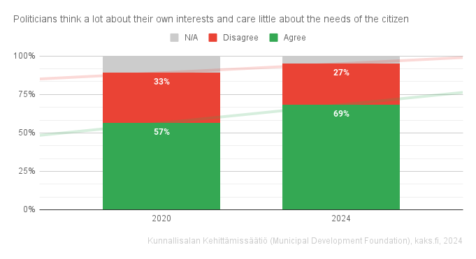
Big yes to those data labels! The trend lines don’t tell much of a story when there’s only two points along the x-axis. Actually the red trend line is confusing since it trends up I’d expect “more” of a disagree but the data labels show there were 5% less disagree.
Certainly, columns will even be clear without reordering. Also, darker shade of grey for n/a would be good, maybe, but here it is already much easier to understand that it’s not background
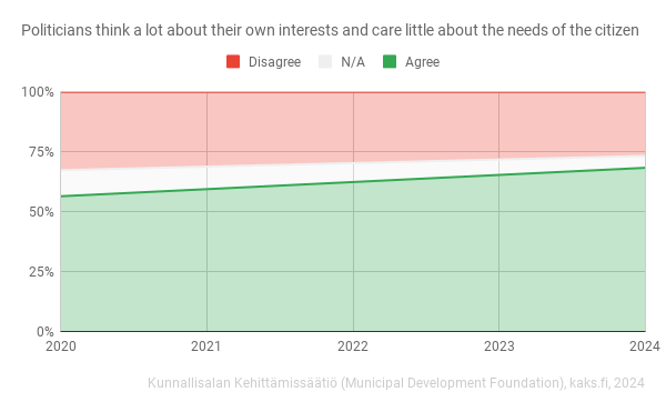
100% stacked charts are stacked for a reason, but would reordering the answers and switching to columns help?
I like this format the best of the three charts you posted here. Something about stacking them in order from smallest to biggest makes more sense
Yeah I like how it got upgraded with new ideas
Trend lines and data labels?
Big yes to those data labels! The trend lines don’t tell much of a story when there’s only two points along the x-axis. Actually the red trend line is confusing since it trends up I’d expect “more” of a disagree but the data labels show there were 5% less disagree.
Certainly, columns will even be clear without reordering. Also, darker shade of grey for n/a would be good, maybe, but here it is already much easier to understand that it’s not background