Loving how these communities invariably contain the most boring visualizations possible or the most boring data you could collect
“Data is lackluster” just isn’t as catchy.
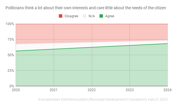
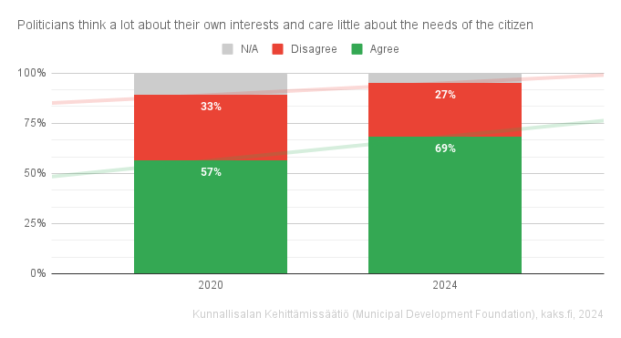
did they take measures between 2020 and 2024? if not, from a dataviz standpoint, i don’t think years 2021, 22, 23 should be included in the x-labels; it makes it look like a clean, linear increase through the years.
Yes, 2020 and 2024. I like your idea, I’m not sure if I can implement it with Google Sheets
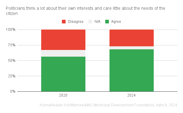
Edit: They can be stacked maybe
Give me that amount of money and power, combined with almost no repercussion for being a selfish prick to keep that life style, and I too may not be the upstanding citizen I like to think of myself.
I honestly think we would be a lot better off if decisions where made by random citizens - kind of like jury duty, instead of professional politicians.
I don’t trust the random citizen, they elected Hitler after all
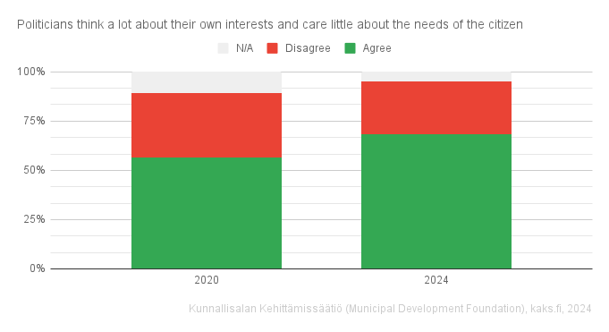
This graph confused me for some time
Also, *surprised Pikachu.jpg*
Probably because of the statement form? I couldn’t decide if it should be converted to a question… Or something with the visual?
The visual, neutral looks like no graph, and coloured parts have one of their sides highlighted. It looks like there are two independent graphs stacked on top of each other
100% stacked charts are stacked for a reason, but would reordering the answers and switching to columns help?
I like this format the best of the three charts you posted here. Something about stacking them in order from smallest to biggest makes more sense
Yeah I like how it got upgraded with new ideas
Trend lines and data labels?
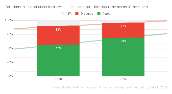
Big yes to those data labels! The trend lines don’t tell much of a story when there’s only two points along the x-axis. Actually the red trend line is confusing since it trends up I’d expect “more” of a disagree but the data labels show there were 5% less disagree.
Certainly, columns will even be clear without reordering. Also, darker shade of grey for n/a would be good, maybe, but here it is already much easier to understand that it’s not background
why? 100% disagree
(50+25×2/3)% n/a
and (50+25×1/3)% agree
easy
Representative democracy’s flaw is that representatives have little accountability. A bad actor has 2-6 years to do whatever they want. Enrich themselves, their friends, benefit a company that will give them an extremely cushy consultancy role when they leave the government, enact deeply unpopular laws, etc.
When you consider other things like the fact that representatives (at least in the us) are usually from a political class that has nothing in common with the working man, the fact they are almost never minoritized demographics, and they never see their constituents face to face until its time to hit the campaign trail, it’s no surprise they don’t value your interests until its time to demand your vote come November.
That’s an extremely straight line, my guy.
Hope they update the survey yearly from now on. I put those two year points to a stupid sheets forecast and 80% mark of disgruntled people will pass around 2028 according to that.


