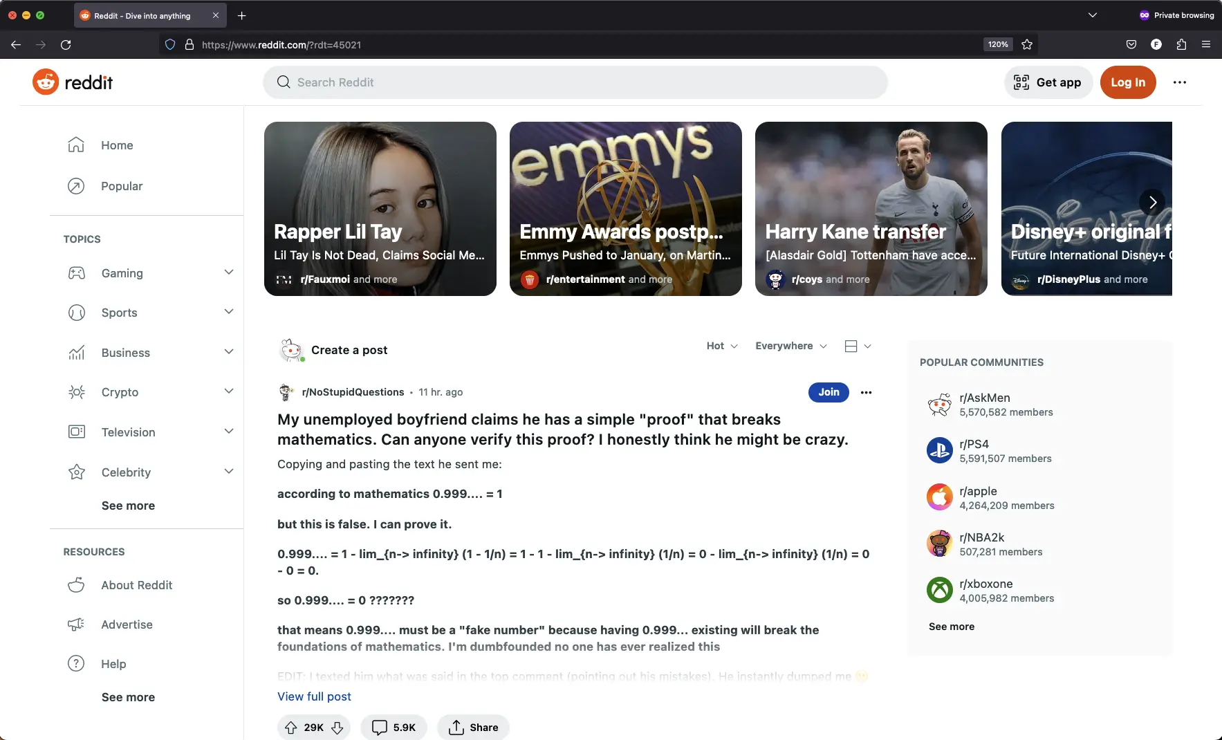
Notice there is only 1 full headline (from /r/NoStupidQuestions) visible, it doesn’t even show the full post. There are 3 of those “trending” boxes but only 2 of those even fit their headlines because they are like 3 words long, they cut off anything longer including the description
I originally became addicted to Reddit because of how streamlined it was to skim dozens of headlines and pick from lots of content, seems they have decided content is not something they want to provide anymore :/


The fact that crypto is listed on the side makes me wanna bump my head on the wall.
The whole thing in general looks like a mobile app stretched to fit on a monitor. I mean, that’s how most websites are in 2023.
funnily enough, it literally fucking is, this was originaly their mobile site.
deleted by creator
That’s not a mobile first principal. Mobile first design and development includes progressive enhancement as the viewport grows. You can make a website that operates perfectly on mobile and desktop. These fucks just don’t actually adhere to any philosophies or standards. Don’t blame mobile first, which is a brilliant approach, for the shortcomings of a dumb-ass company like Reddit.
It’s called “responsive design” i think. I played around with it a bit when learning html years ago. You can get free website templates that have this cooked in - like, you don’t need to code anything. Seems easy to do and pretty much an industry standard now. Pretty weird that reddit would choose a trashy option instead.
Responsive design is approach you can use as part of your mobile first development. There are others, but responsive is a good one.
deleted by creator
So much white space…so many frames…so much waste…I can’t look away…it’s whispering to me …
Mandatory Website Obesity Crisis mention, TL;DR:
A lot of apps are also just web wrappers for a mobile site… It’s obvious with some apps, others are a bit harder to see, but it’s there.
Low effort app developing.