This website contains age-restricted materials including nudity and explicit depictions of sexual activity.
By entering, you affirm that you are at least 18 years of age or the age of majority in the jurisdiction you are accessing the website from and you consent to viewing sexually explicit content.
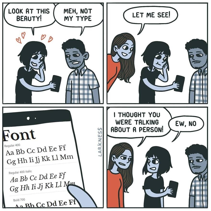
Love the lowercase, hate the uppercase. Look at what they did to my boy B.
I really love the numbers, though.
I’ve discovered that it’s a horrible screen font, though: far too spindly to be easily readable. I still use it, but I have to make it larger than usual and bold, and it’s still a little hard to make out sometimes.
Oh, what we sacrifice for aesthetics.
0 seems a bit too indistinguishable from O, but otherwise I’m also a big fan of the numbers.
I think the font heavily reuses glyphs. 0 probably literally is the same glyph as O. I’m positive 9 is just a rotated 6 (I guess that’s pretty common, although it’s really obvious in Poiret).
What’re you looking at?? His gut?? He’s working on it!
You might enjoy Futura, the ITC Avant Garde Gothic family, or Century Gothic…
I love Century Gothic and most of Futura, though I’m not sure how I feel about Futura’s lowercase j.
Gets the job done, with minimal effort.