
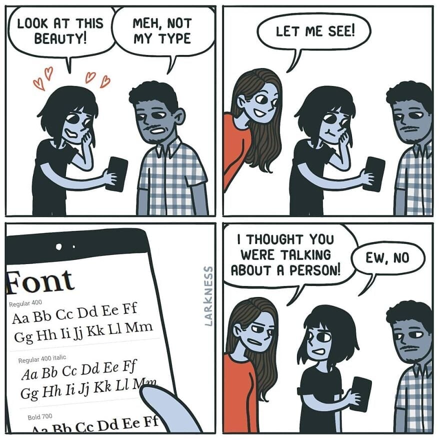
It’s a good job they explained the joke.
Wasn’t there some theory about comics being improved by removing the final panel?
Definitely. I was going to post this:
Remove 4th panel.
No. I like the “ew”.
The “ew” saved it.
I also like expression of the person finding out what they’re talking about
you don’t need 2 either. 1 is the setup, 3 is the punchline.
Wasn’t there a subreddit about improving comics? Usually just removing the panel that rams the punch line down your throat.
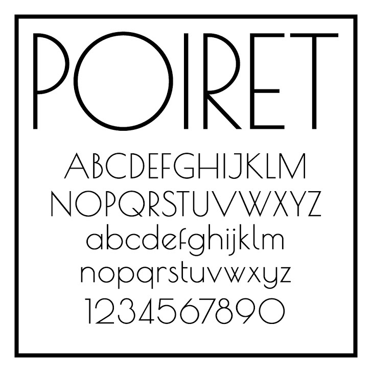
The most beautiful font ever. Although, this Metropolis is pretty nice, too.
Love the lowercase, hate the uppercase. Look at what they did to my boy B.
I really love the numbers, though.
I’ve discovered that it’s a horrible screen font, though: far too spindly to be easily readable. I still use it, but I have to make it larger than usual and bold, and it’s still a little hard to make out sometimes.
Oh, what we sacrifice for aesthetics.
0 seems a bit too indistinguishable from O, but otherwise I’m also a big fan of the numbers.
I think the font heavily reuses glyphs. 0 probably literally is the same glyph as O. I’m positive 9 is just a rotated 6 (I guess that’s pretty common, although it’s really obvious in Poiret).
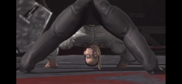
What’re you looking at?? His gut?? He’s working on it!
You might enjoy Futura, the ITC Avant Garde Gothic family, or Century Gothic…
I love Century Gothic and most of Futura, though I’m not sure how I feel about Futura’s lowercase j.
I’m not sure how I feel about Futura’s lowercase j
Gets the job done, with minimal effort.
I have the urge to drink martini and rewatch The Great Gatsby.
And Jeeves & Wooster, and Poirot.
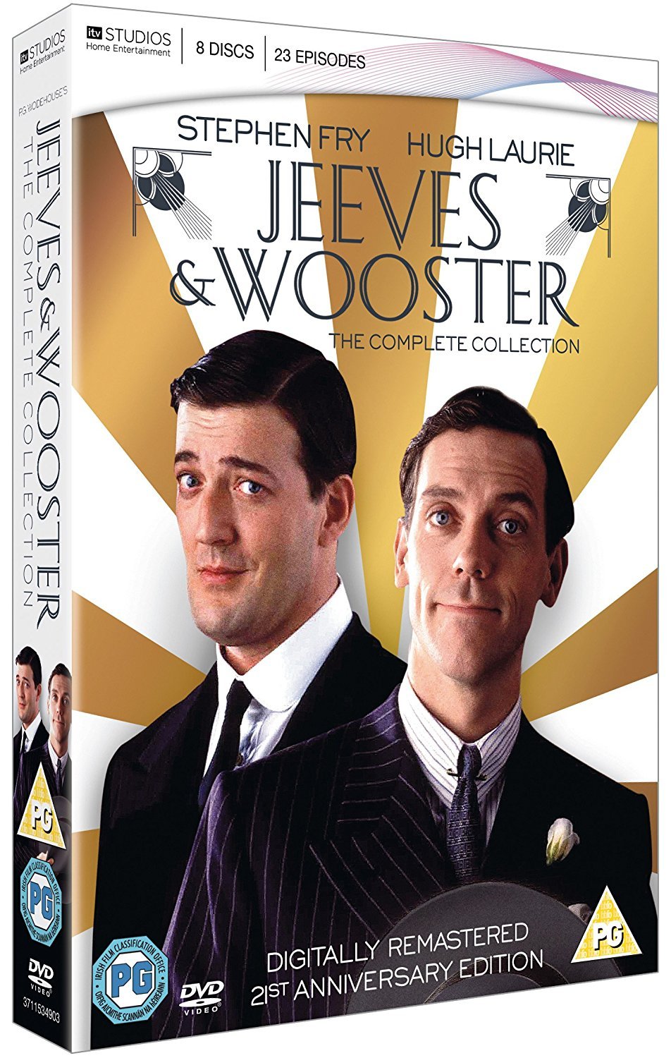
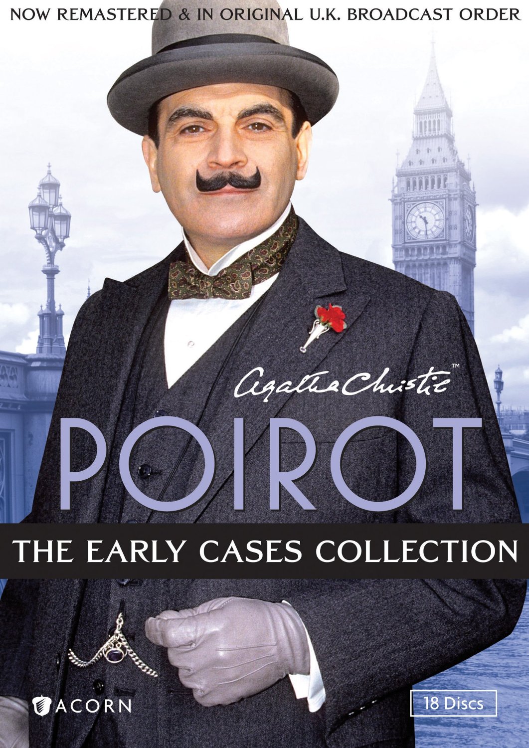
Poirot is obviously the inspiration here, in style and name.
actually disappointed that poirot doesn’t have that font
This has an art nouveau feeling.
I’d say Art Deco, Art Nouveau’s successor, but obviously there aren’t fine lines between them.
When I think Art Nouveau, I think wavy, curvy script; everything was just a little psychedelic in Art Nouveau.
1920’s, in any case.
Wait, is this Comic Sans? Some just want to see the internet burn
I feel like the comic sans hate did die down in recent years and justly so. It was overhated IMHO. It’s an ok font for certain uses. The problem was mostly people misusing it to serve roles it was never designed for.
It will look good in a children story-book. Not in a professional email.
I know a person who professionally does something with text. She made it her mission to format every single email in ComicSans, bold, italic, red, centered.
See that’s funny. My boss using comic sans light blue for emails explaining highly technical shit to non-technical users? Funny in theory, absolutely not in action.
that’s how you teach them to highlight and copy/paste text
Fira Sans ♥️
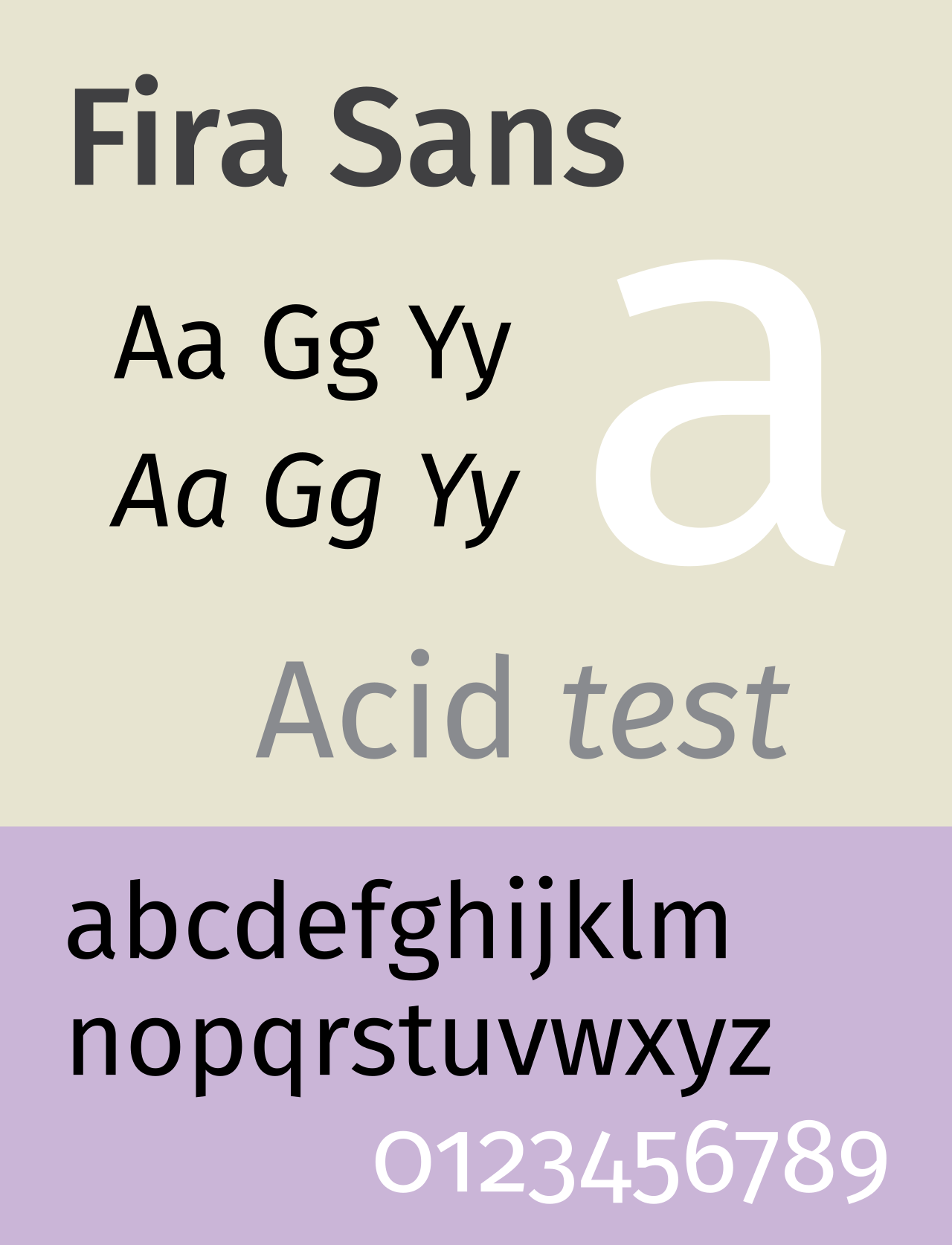
Text looks good, but man the Number hight looks cursed and kinda random.
they’re called lowercase numbers and they’re designed to look good in paragraph text. for example if you’re reading this comment, mentioning the year 1997 suddenly puts four full height characters as if I typed one word in all caps, while in lowercase numbers it would look more like if I typed the word iggy (1 is x height while 9 and 7 have descenders like g and y).
they’re not designed to be used in math or for longer number sequences. for that you have the full height (uppercase) numbers that most typeface should still have.
0123456789 in lowercase have the same heights as oizgjpbyfq - just as random as that word’s letter heights are. which is not random at all, you’re just not supposed to use it like that.
Oh that makes sense, thanks for the information. Still would not want to use something thats not universal.
idk what you mean by universal; this is a typographical choice. the only reason you see more uppercase numbers everywhere is because of typewriters and by extension computers. I don’t think people make a point of lining numbers up with cap height in handwriting.
But we are speaking about a Computer Font right now, idk what that has to do with handwriting and who cares about handwriting in 2024. With universal i mean that any kind of number should look god, no matter if its a Telefon Number, a Price or a Street Number.
we’re not speaking about a computer font, we’re speaking about typography in general. the reason I mentioned them is because the ubiquity was forced by restrictions. we used to type non-english letters without diacritics before different languages got support online. now we don’t have those restrictions either. what you said is not universal; there are different kinds for different uses. just like uppercase and lowercase letters.
Their shape is beautiful (from 3 to 9) but why were they not written on the same line?
lowercase numbers, check my comment above if you’re interested
Pure elistism. 0 1 and 2 were the original high digits created by imperialist powers that reigned supreme for thousands of years.
After the first number wars, 3-9 started to demand equal rights at the bargaining table.
In order to keep the hierarchy in place, 6 and 8 were empowered as class traitor pawns to subjugate the other lower digits. Hence their perceived elevated status.
Why did 6 hate 7? Because 6 and 8 86’d anyone who didn’t fall in line. No one even knows about digit [redacted] anymore.
It appears that the middle line crosses the centre of mass.
deleted by creator
If your font type was a person:
GIMME AN A
They did, in fact, nail it.
I’m more of a sans serif kinda guy
Grotesque.
Atkinson hyperlegibile is hands down the best for reading ebooks. It was designed for visually impaired people, but it’s also super easy on the eyes for everyone else. I read so much faster and more comfortably with this that I can’t imagine using anything else.

Baskerville
I like Ubuntu Mono but I’ll admit it’s a bit flashy for a code font.
Universal Grotesk
This would totally be Brick from The Middle
ITC Avant Garde, so beautiful
…Isn’t Avant Garde a sans serif?
I don’t know, I just love how it looks
Yes, it’s grotesque.
Verdana is my fucking jam. Good spacing and very legible at different font sizes. My only two gripes: Lower case “l” (L) being a straight line and the number 0 has no cross through it. Not major though, cause they’re still pretty distinct from similar characters.

Eh, just a cheap Helvetica clone.
?

I didn’t say it was a well made cheap Helvetica clone. 🤷♂️
verdana is great for small sizes on screen. it was designed specifically for that purpose so it would look good with pixellation. it’s probably the most successfully designed Microsoft font to date. if you want to type anything in like 5-6pt font verdana is a great choice. but that also makes it bulky and inelegant at larger font sizes.
if you want a sans serif default ms font to use in larger sizes the segoe font family is pretty good.
The biggest factor for me with fonts is readability (I have my notepad++ default to verdana at 16pt font on a 1080p monitor which is my ideal). It’s probably worth mentioning that my eyesight isn’t great and I think I have some kind of brain related trouble with print.
Segoe is okay, but the font is really thin and the spacing is too narrow for me.
yeah I said for big sizes. 16 is more mid, and not perfect for segoe’s thin lines. i think verdana is still a bit too bulky for 16 but for any kind of vision impairment it should be great. you might want to try trebuchet. another low contrast default ms font but it’s a bit more humanist and pleasing to look at in those sizes.
Monaspace Krypton for coding. I’ll take no questions.
what’s a llama?
The subtle kerning of it, the tasteful thickness of it, my god it’s even got serifs.


