This website contains age-restricted materials including nudity and explicit depictions of sexual activity.
By entering, you affirm that you are at least 18 years of age or the age of majority in the jurisdiction you are accessing the website from and you consent to viewing sexually explicit content.
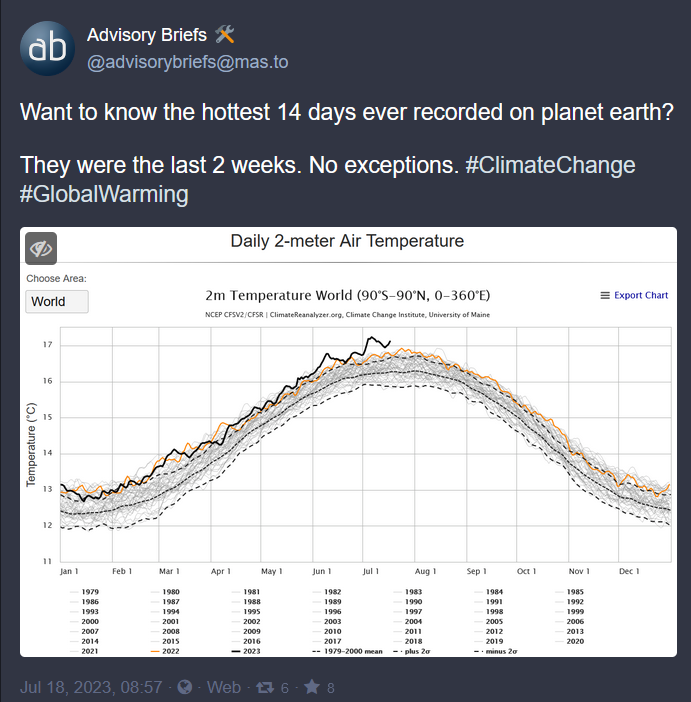
Here is a graphic to help visualize the unprecedented rate of temp change. Data source for temperature is cited and likely errors are explained. https://xkcd.com/1732/
It’s actually worse than that. We are not in the predicted path, we are in one of the worst estimated predicted paths. Understandable as that comic was made in 2012.
Yeah, you’re right. It would be even more obvious now if it were redone. I specifically like that one because it invites people to scroll through the time axis slowly and on a linear scale. It makes the recent changes more real than the same graph fitted to a screen and seen all at once.
Can’t stand those comics. Thanks but no thanks.
They cite their sources. I got paywalled by the Marcott paper, but that seems like it has data you’re looking for. I think most of the referenced links are as follows:
Shakun https://www.nature.com/articles/nature10915
Marcott https://www.science.org/doi/10.1126/science.1228026
Annan and Hargreaves https://cp.copernicus.org/articles/9/367/2013/cp-9-367-2013.html
Hadcrut4 https://psl.noaa.gov/data/gridded/data.hadcru4.html
Dang climate change denial is one thing but speaking ill of xkcd on the internet are you a fucking madman?